HOW TO USE VIZ TOOL
This guide will walk you through the steps to create and customize charts using the UNDP Viz Tool.
Getting Started
To start creating your own charts, visit the UNDP Viz Tool.
This guide will walk you through all the steps of creating visualizations with the tool, including uploading data, choosing a chart type, and configuring your chart. Additionally, you will find step-by-step video tutorials.
Visualization Steps
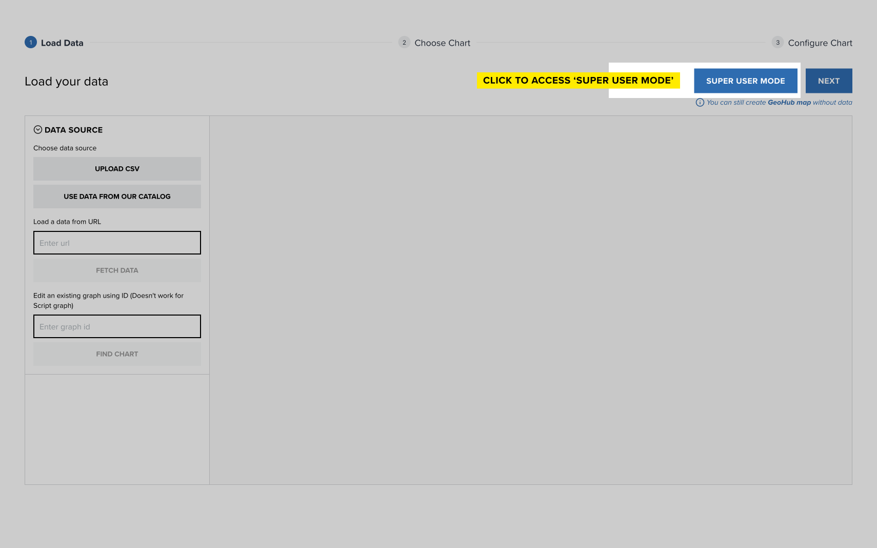
On the Load Data screen, you have multiple options for inputting your data:
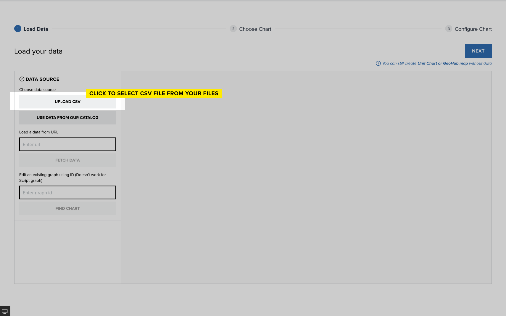
Upload CSV: Click this button to upload a data file from your computer in CSV format.
Use Data from the Data Futures Exchange Catalog: Select from a pre-existing catalog of datasets.
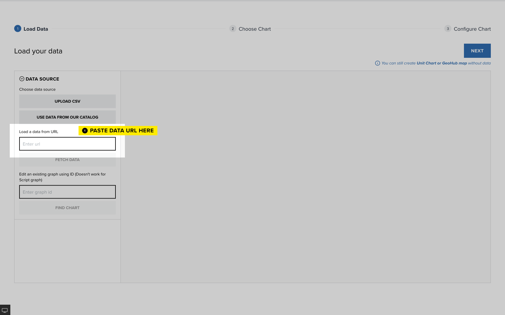
Load Data from URL: Paste the URL of the data you want to load, then click Fetch Data.
How to create URL in Google Sheets
Please note that simply copying the Google Sheets link won’t work, as the document will not be published. To create a publicly accessible link, please follow these steps:
- Open the Google Sheet: Go to the Google Sheets document you want to share.
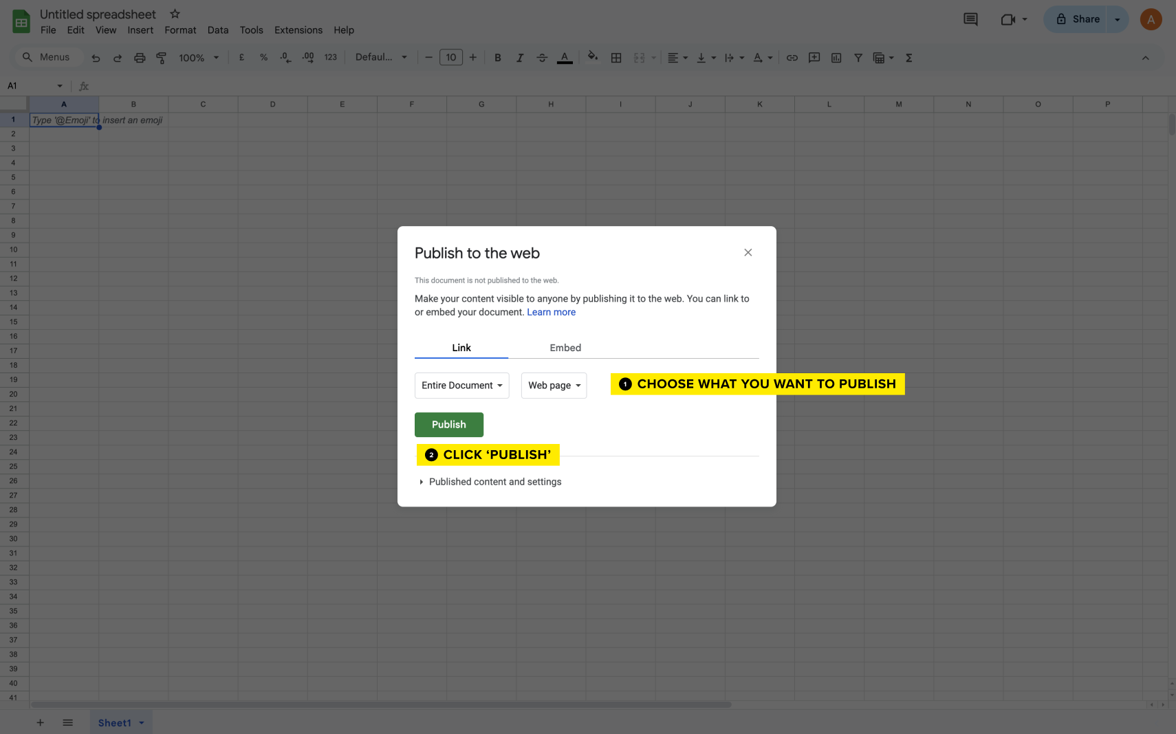
Click on 'File': In the top menu, select File. In the File dropdown menu, click Share and then choose Publish to the web:
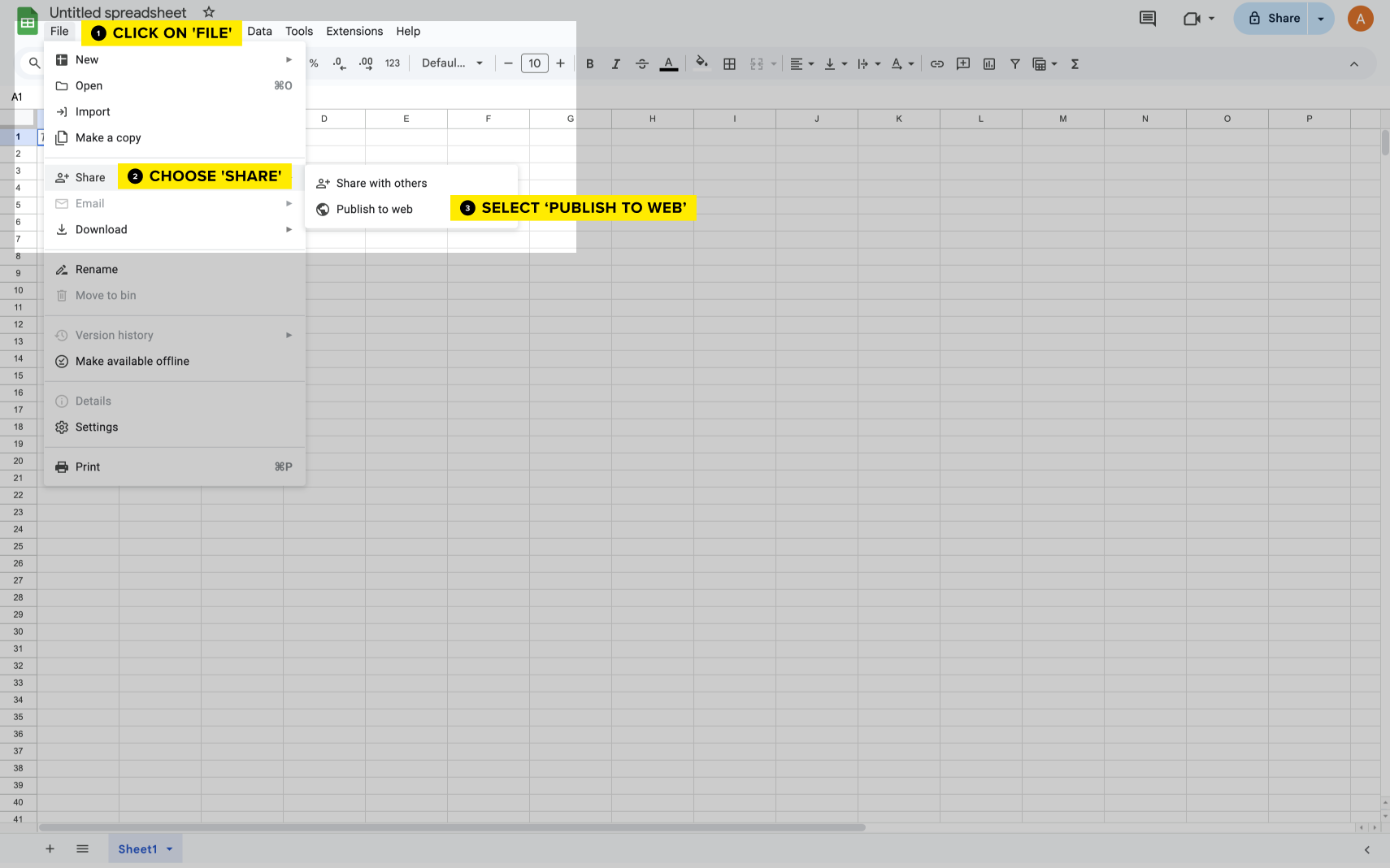
Publish the Document: a window will open where you can choose what you want to publish (e.g., the entire document or specific sheets). Click Publish and confirm if prompted.
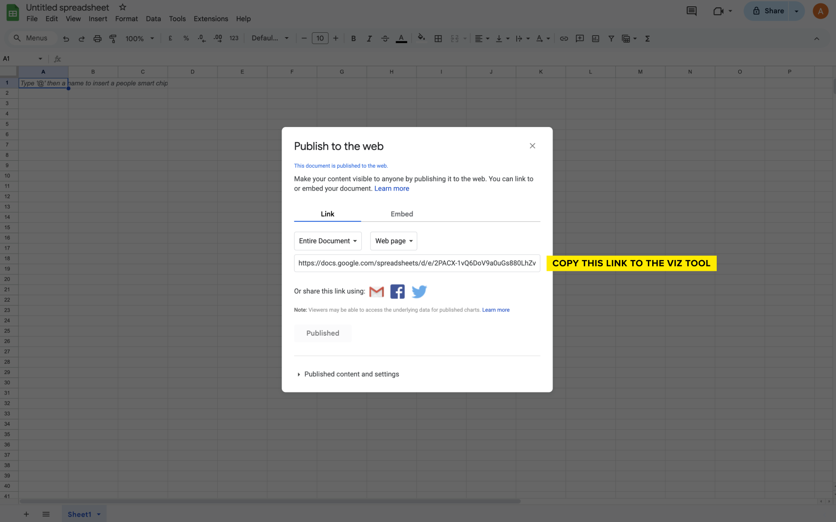
Copy the Published Link: once published, a link will appear. This is the public URL you can put in the UNDP Viz Tool.
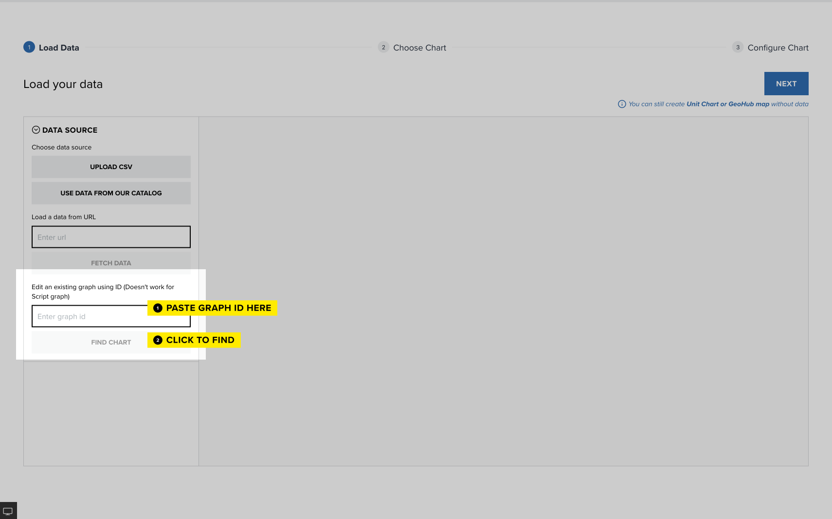
Edit an Existing Graph by ID: If you know the ID of an existing graph, you can enter it here to make changes.
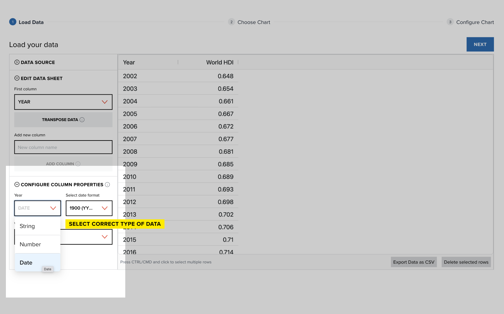
After loading the data, it will appear on the right side of the data visualization tool.
Before proceeding, review the data types in the 'Configure Column Properties' section, which include number, string, date, and alpha-3 code. Ensure all columns are assigned the correct data type, such as setting the 'Year' column to 'Date'.
There is an option to add metadata based on alpha-3 country codes. You can include official country names, continents, UNDP regions, subregions, income groups, latitude, and longitude. To do this, simply check the 'Metadata' box below the country code type.
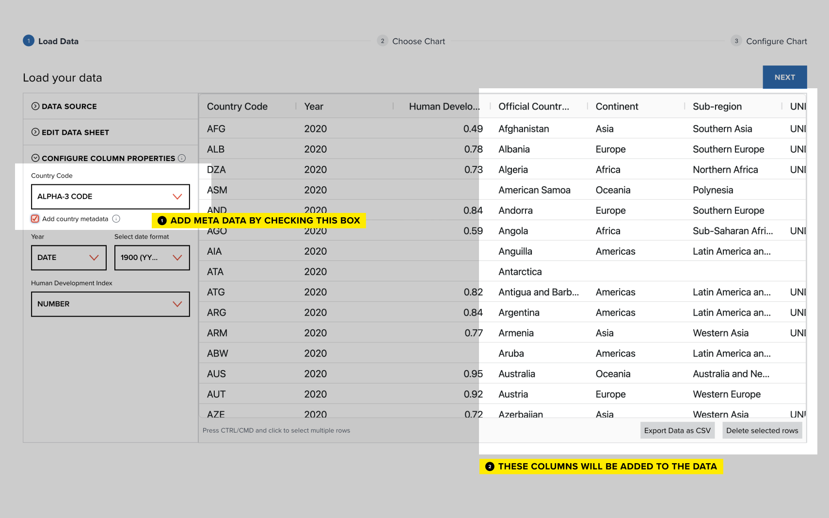
Next, check the data on the right side of the tool. You can edit values by clicking on them, and select rows using CMD/CTRL to delete by clicking the 'Delete Selected Rows' button.
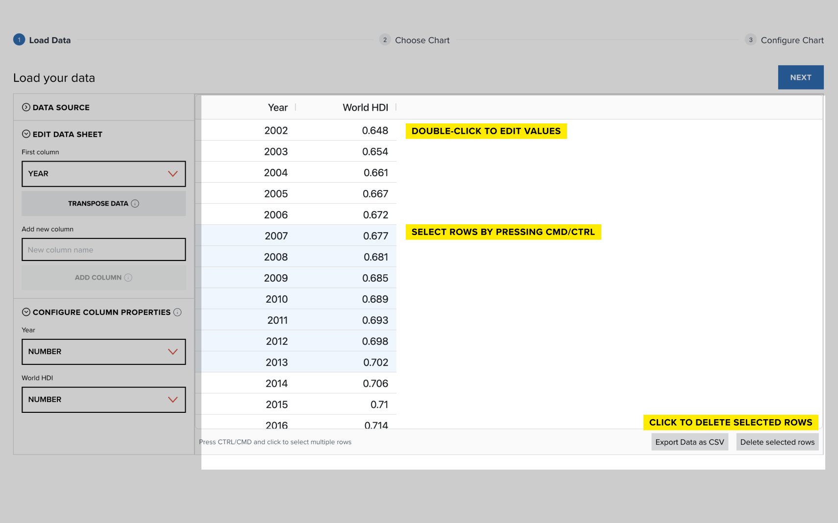
Once you've selected or uploaded your data, click Next to proceed to choosing your chart type.
After loading your data, you can now select the type of chart that best fits your data visualization needs. In this section, you'll find a wide range of chart types, along with a filter by function to help you decide which chart to use.
Please note, if your data format isn't supported for this graph, a red exclamation mark icon will appear. Check the sample CSV file and adjust your data by clicking 'Back'.
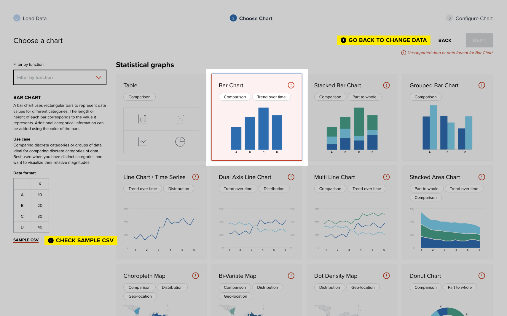
Once you've chosen the appropriate chart type, click Next to move on to the configuration step, where you can further customize your chart's appearance and functionality.
After selecting your chart, you can customize it through various configuration settings. The available settings may vary depending on the chart type, but here are the general categories you’ll work with:
- Map Settings (if applicable): Choose the world, region, or country map, and set the map center and scale.
- Graph Size and Margin Settings. Adjust the size of your chart and define margins to fit your layout needs.
- Graph Configuration. Fine-tune specific details related to your chart, such as axes, gridlines, and scales.
- Graph-Specific Layout. Modify layout settings that are unique to the chart type you're using.
- Color Settings. Customize the colors used in your chart for visual clarity and branding purposes.
- Add Reference Line. Include reference lines to highlight key thresholds or benchmarks in your data.
- Graph Labels and Titles. Set the title, axis labels, and legends to make your chart easy to understand.
- Mouseover Settings. Configure what information appears when hovering over data points.
After configuring your chart, you have multiple options to download or embed it into your webpage or report.
Download your chart: click the Download Graph button. Then, choose the format for downloading your chart: PNG for standard static images or SVG for scalable, high-quality graphics.
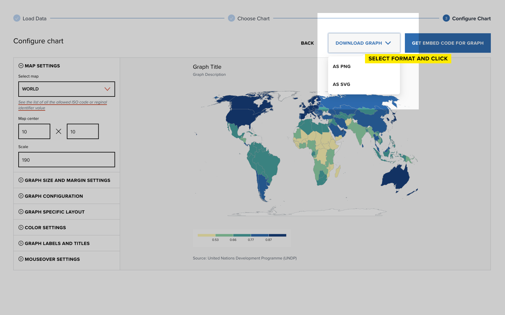
Get graph URL: a direct URL to access your graph online.
Embed with Script (Recommended): ideal for modern web pages, but sometimes external websites can block this option. If blocked, proceed with the iframe option. This method uses JavaScript and web components.To embed a single graph, select 'Single Visualization.' For embedding multiple graphs on the same page, choose 'Multiple Visualization.' Then, copy and paste the provided script into your webpage’s HTML file.
iFrame Embed Code: if you prefer using an iframe, or if the script option is blocked, you can copy the provided iframe code and paste it directly into your HTML. The iFrame embed code includes the width and height of your chart, which you can adjust to fit your page layout.
Step-by-Step Video Tutorials
Below, you will find video tutorials that guide you through creating charts from scratch, including steps for data upload, customization, and embedding.
Simple bar chart
Grouped bar chart
Stacked bar chart
Simple Line Chart
Multi-Line Chart
Dual-Axis Line Chart
Choropleth map
Bi-variate map
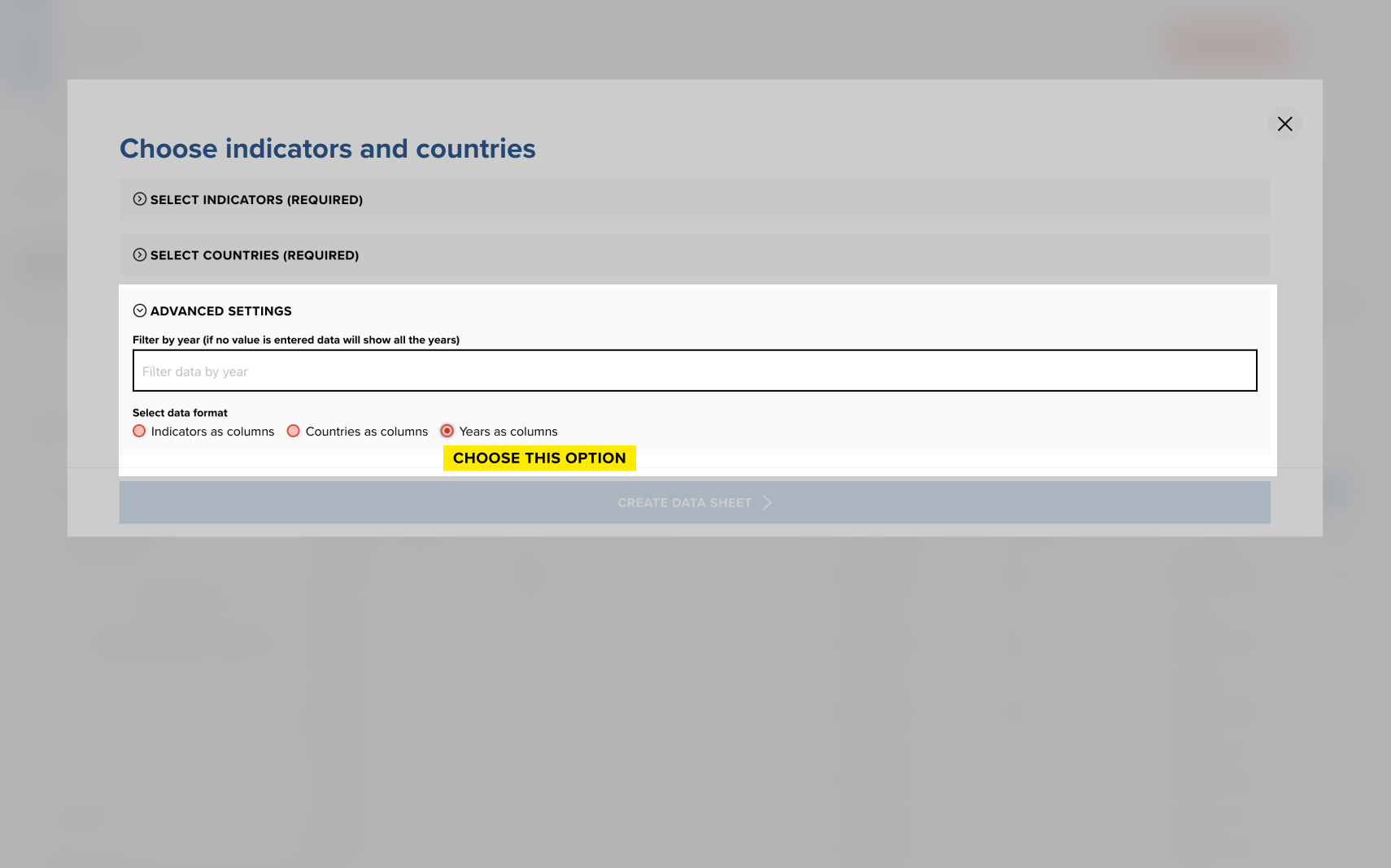
Note: For the slope chart, values for each side should be in separate columns in the datasheet. For example, if you want to use the years column from the data catalog, please check the option 'Years as columns' in the 'Advanced settings' section:
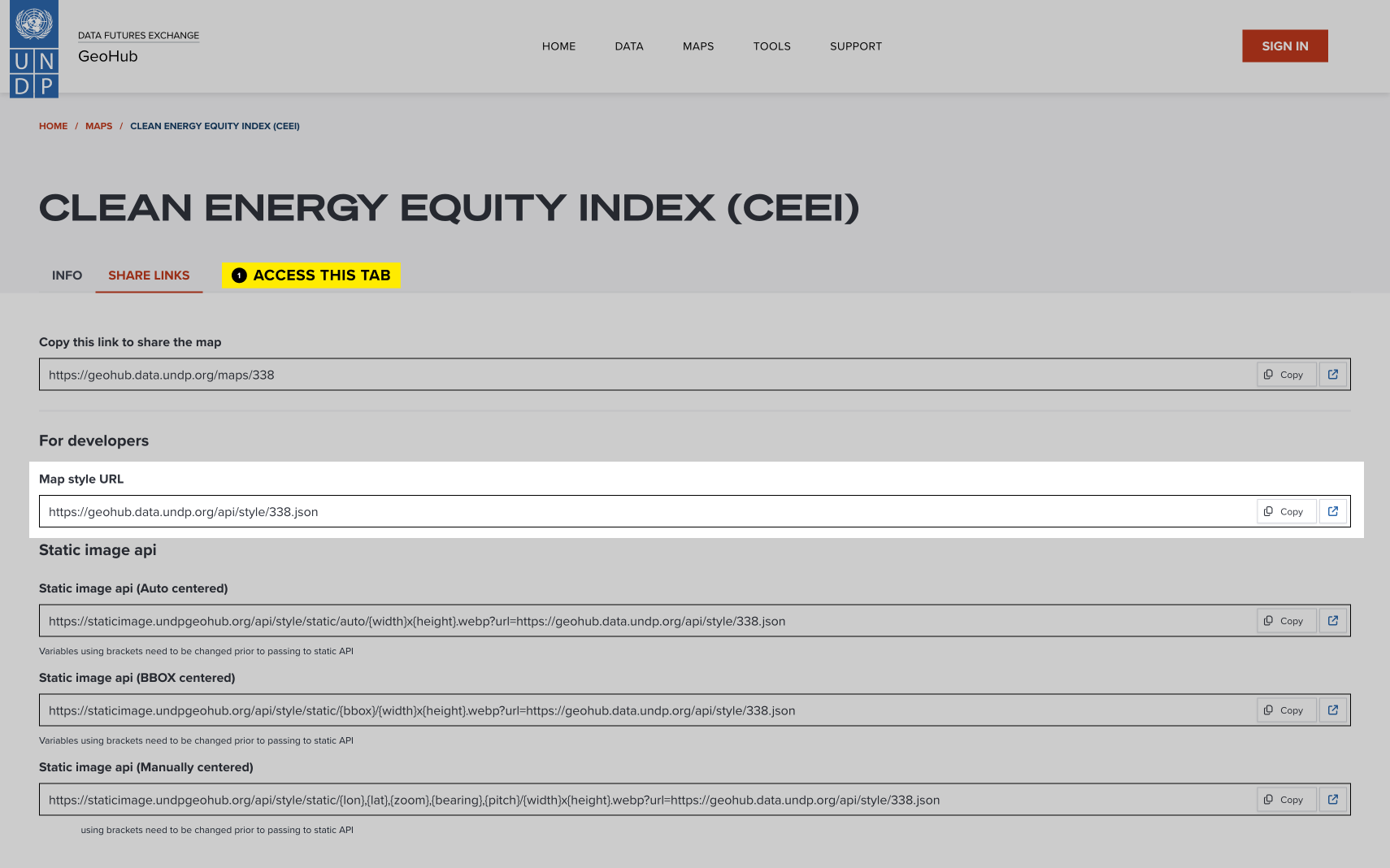
You can embed any map from GeoHub. Browse the Maps page or create your own, then copy the style JSON URL from the 'Share Links' tab.
Single GeoHub map
Compare GeoHub map
Advanced (JSON editor)
The Viz Tool JSON editor offers advanced customization, such as adding filters, transforming and filtering data, creating animated charts with year sliders, and RTL visualizations. Using the editor unlocks the full potential of the UNDP Data Visualization Library. Familiarity with the JSON file format and the library documentation will be helpful in utilizing these features.
Annex
The following are available features of the UNDP Data Visualization Library, which can be configured in the JSON editor, along with examples:
The dataSettings feature allows users to define settings for importing, processing, and transforming data from various sources like CSV, JSON, or APIs. Users can specify the data source URL, file type, data handling methods, and transformation options.
Example with a simple CSV file(s):
  "dataSettings": {
    "dataURL": "https://example.com/data.csv",
    "idColumnName": "id",
    "fileType": "csv",
    "delimiter": ",",
  }
dataURL can be an array of strings if you have multiple CSV files
  "dataSettings": {
     "dataURL": [
      "https://example.com/data1.csv",
      "https://example.com/data2.csv"
    ],
    "idColumnName": "id",
    "fileType": "csv",
    "delimiter": ",",
}- dataURL: A string or an array of URLs to the CSV file(s).
- idColumnName: The primary key column used to merge data across files.
- fileType: Specifies the file type as "csv" or "json".
- delimiter: Sets the delimiter for CSV data to a comma (
,).
Example with an API data source:
 {
  "dataSettings": {
    "dataURL": "https://api.example.com/data",
    "idColumnName": "id",
    "fileType": "api",
    "apiMethod": "POST",
    "apiHeaders": {
      "Authorization": "Bearer token"
    },
    "apiRequestBody": {
      "query": "exampleQuery"
    },
    "dataTransformation": "{{json data}}"
  }
}- dataURL: URL to the API endpoint.
- idColumnName: Primary key for merging data (in this case, "id").
- fileType: Specifies the file type as "api".
- apiMethod: Sets the HTTP method to
POST. - apiHeaders: Adds an authorization header for API access.
- apiRequestBody: Defines the body content for the API request.
- dataTransformation: Uses a Handlebars template to extract the
dataobject from the API response.
Additionally, there is a feature columnsToArray that allows to transform strings 'tag 1, tag 2, tag 3' into an array or strings. This will help to visualize the number of tags.
For example, if you have data like this:
[
  { "Country": "Country A", "Tags": "tag 1, tag 2, tag 3" },
  { "Country": "Country B", "Tags": "tag 1, tag 2" },
]
After using columnsToArray, this data would look like:
[
  { "Country": "Country A", "Tags": ["tag 1", "tag 2", "tag 3"] },
  { "Country": "Country B", "Tags": ["tag 1", "tag 2"] },
]
And after applying dataTransform to count each tag's occurrences (more information about dataTransform below):
"dataTransform":{
  "keyColumn": "Tags",
}
The data becomes:
[
  { "Tags": "tag 1", "count": 2 },
  { "Tags": "tag 2", "count": 2 },
  { "Tags": "tag 3", "count": 1 }
]
This final structure can now be used to create a chart, such as a donut chart, where each tag is visualized by its count:
"graphDataConfiguration": [
  { "columnId": "Tags", chartConfigId: "label" },
  { "columnId": "count", chartConfigId: "size" }
]
The dataFilters feature allows you to filter data by specifying a key column and values to include or exclude. This helps refine the dataset to only relevant data based on specific conditions.
"dataFilters": [
    {
      "column": "Column 1",
      "includeValues": ["Value 1"],
      "excludeValues": ["Value 2"]
    }
  ]
Key Settings:
- column (required): Specifies the key column whose values are used for filtering.
- includeValues (optional): Lists values to be included from the specified column.
- excludeValues (optional): Lists values to be excluded from the specified column.
The dataTransform feature allows you to transform data by aggregating or counting unique values based on a specified key column. This is useful for grouping data or calculating totals, averages, minimum, or maximum values for specific columns.
Example 1: Counting Unique Values
"dataTransform": {
    "keyColumn": "Region"
  }
Data before:
[
  { "Region": "Region A", "Country": "Country 1" },
  { "Region": "Region A", "Country": "Country 2" },
  { "Region": "Region B", "Country": "Country 3" },
  { "Region": "Region B", "Country": "Country 4" },
]
Transformed data:
[
  { "Region": "Region A", "count": 2 },
  { "Region": "Region B", "count": 2 }
]
Now, you can use this transformed data to configure your chart. For example, if you're creating a donut chart to visualize the number of regions, the graphDataConfiguration would look like this:
"graphDataConfiguration": [
        { "columnId": 'Region', "chartConfigId": 'label' },
        { "columnId": 'count', "chartConfigId": 'size' },
      ]
Example 2: Aggregating Values
  "dataTransform": {
    "keyColumn": "Region",
    "aggregationColumnsSetting": [
      { "column": "Indicator", "aggregationMethod": "sum" }
    ]
  }
Data before:
[
  { "Region": "Region A", "Country": "Country 1", "Indicator": 10 },
  { "Region": "Region A", "Country": "Country 2", "Indicator": 20 },
  { "Region": "Region B", "Country": "Country 3", "Indicator": 30 },
  { "Region": "Region B", "Country": "Country 4", "Indicator": 10 },
]
Transformed data:
[
  { "Region": "Region A", "count": 2, "Indicator": 30 },
  { "Region": "Region B", "count": 2, "Indicator": 40 }
]
Now, you can use this transformed data to configure your chart. For example, if you're creating a donut chart to visualize the total number of Indicator for each region, the graphDataConfiguration would look like this:
"graphDataConfiguration": [
        { "columnId": 'Region', "chartConfigId": 'label' },
        { "columnId": 'Indicator', "chartConfigId": 'size' },
      ]
Key settings:
- keyColumn (required): Defines the key column for grouping or counting unique values.
- aggregationColumnsSetting (optional): Specifies columns to aggregate using methods like
sum,average,min, ormax. Defaults tosumif not defined.
The filtres feature allows you to add filters to a chart or dashboard by setting parameters such as the data column, selection type (single or multiple), and default values. For example:
  "filters": [
    {
      "column": "Column 1",
      "singleSelect": false,
      "clearable": true,
      "defaultValue": "Value 1",
      "label": "Filter by column name",
      "excludeValues": ["Value 2"]
    }
  ]
Key Settings:
- column (Required) - Data column for filtering.
- singleSelect - Allows single (true) or multiple (false) selections.
- clearable - Allows clearing the filter.
- defaultValue - Sets default selection(s).
- label - Custom label for the filter.
- excludeValues - Values to exclude from the dropdown.
The dataSelectionOptions feature lets users choose dataset columns to visualize in a chart or dashboard. Options include a label, selectable columns, target chart configuration, and the choice of dropdown or radio button for the interface.
"dataSelectionOptions": [
    {
      "label": "Visualize",
      "allowedColumnIds": [
        {
          "value": "Column 1",
          "label": "Column 1"
        },
        {
          "value": "Column 2",
          "label": "More Descriptive Label"
        }
      ],
      "chartConfigId": "size",
      "ui": "select"
    }
  ]
Key Settings:
- label (optional): Sets a label for the selection dropdown.
- allowedColumnIds (required): Defines selectable columns with
valuematching the data header andlabelas a user-friendly name. - chartConfigId (required): Identifies the chart configuration that this selection affects.
- ui (optional): Specifies the UI element type – either
"select"(dropdown) or"radio"(single-select or checkbox for multi-select).
- horizontalBarChart
- horizontalStackedBarChart
- horizontalGroupedBarChart
- verticalBarChart
- verticalStackedBarChart
- verticalGroupedBarChart
- animatedHorizontalBarChart
- animatedHorizontalStackedBarChart
- animatedHorizontalGroupedBarChart
- animatedVerticalBarChart
- animatedVerticalStackedBarChart
- animatedVerticalGroupedBarChart
- horizontalBeeSwarmChart
- verticalBeeSwarmChart
- butterflyChart
- animatedButterflyChart
- circlePacking
- dataTable
- donutChart
- horizontalDumbbellChart
- verticalDumbbellChart
- animatedHorizontalDumbbellChart
- animatedVerticalDumbbellChart
- heatMap
- histogram
- lineChart
- multiLineChart
- differenceLineChart
- dualAxisLineChart
- sparkLine
- choroplethMap
- biVariateChoroplethMap
- dotDensityMap
- animatedChoroplethMap
- animatedBiVariateChoroplethMap
- animatedDotDensityMap
- geoHubCompareMap
- geoHubMap
- geoHubMapWithLayerSelection
- paretoChart
- scatterPlot
- animatedScatterPlot
- slopeChart
- stackedAreaChart
- statCard
- horizontalStripChart
- verticalStripChart
- treeMap
- unitChart
For detailed information on each graph type and schemas, refer to the full library documentation.
Get Support
Please email our team at data@undp.org if you need assistance with the Data Viz Tool.
